
The November 2025 Power BI Feature Summary is a big month for the ecosystem, and a nice mix of learning perks, practical reporting upgrades, and foundational work on metrics. As always, we are cutting through the Power BI release notes noise to call out what helps real teams ship better analytics faster.
Get certified in Microsoft Fabric for free
Microsoft is offering a limited pool of free DP-600 exam vouchers. If you or your team are already working in Fabric, this is an easy uplift for capability and credibility. Book it, schedule study time, and lock it in before the window closes.
Why this is important: free vouchers are more than a perk. They are a forcing function to align on Fabric fundamentals, shared terminology, and common patterns. If you run a center of excellence, bundle study sessions, office hours, and a target date so the whole team moves together.
Export data with visual calculations and hidden fields
You can now export data even when a visual uses visual calculations or hidden fields. Underlying data exports still behave as expected, but for most day to day scenarios this removes a long standing blocker for sharing quick cut tables with stakeholders who live in Excel.
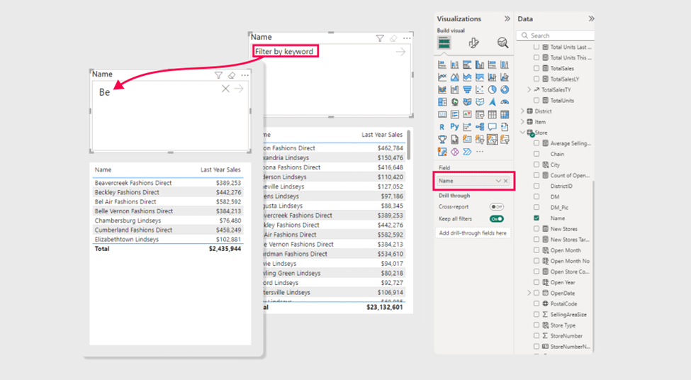
New Text Slicer
The new core Text Slicer lands in preview. It accepts typed input to filter a target field and comes with solid formatting control, so you can finally retire a bunch of home grown workarounds. This is especially handy for large dimension sets where a normal slicer becomes unwieldy.
Why it matters: it improves everyday usability for report consumers. Instead of paging through a long list of categories, they can type what they want and move on. It also cuts down on custom visuals purely used for text search, which reduces maintenance and improves performance.
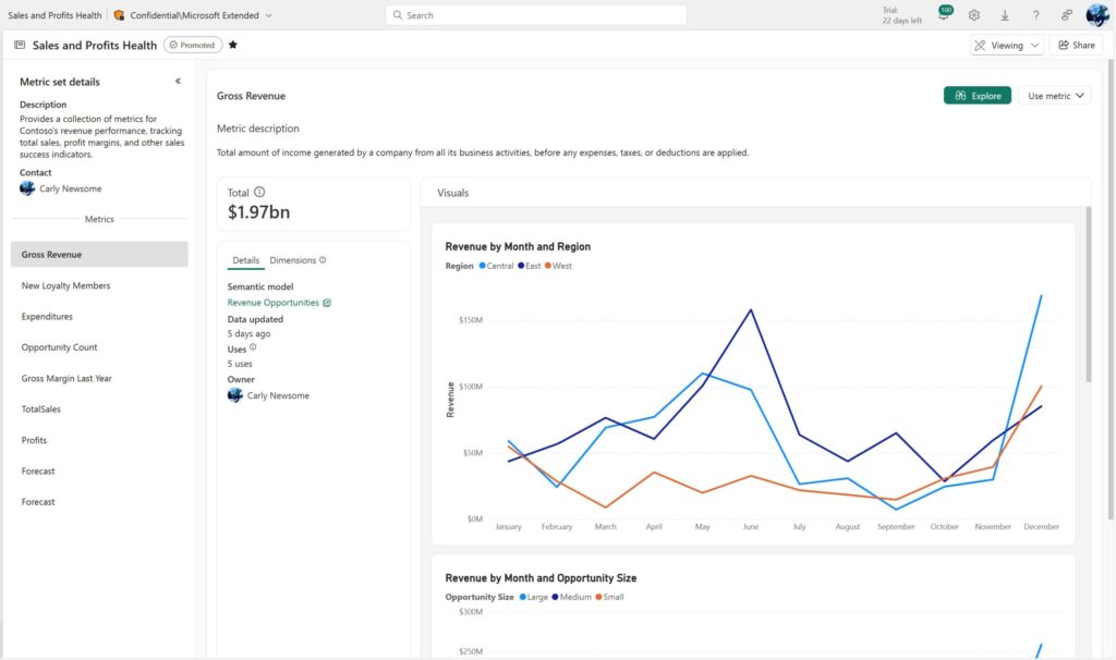
Metric Sets and Metrics Hub
This is a big strategic step. Metric Sets curate measures and required dimensions into a single, trusted surface, then surface them in a Metrics Hub for both creators and consumers. The goal is simple, consistent definitions that travel across reports, better discoverability, and less ad hoc rebuild. For organisations chasing a single version of truth, this is the scaffolding you want.
Why it’s a game changer: think governance that people actually use. Curated measures with required dimensions baked in, discoverable in a single hub, and consumable in both Desktop and the Service. This lowers the cost of doing the right thing. For leaders pushing consistent KPIs, this is the feature to pilot and standardise.
A quick tour of other useful bits (to us, anyway)
Copilot summaries arrive in mobile and can also land in your email subscriptions. Good for leaders on the move who want a readable synopsis without opening the report. As always, it is only as good as your model’s semantics and Prep for AI settings.
Azure Maps Path Layer makes mapping routes and connections much easier. Logistics, networks, travel, even oil and gas use cases all benefit. We continue to recommend an early move from Bing Maps to Azure Maps where your region allows it, both for features and future support.
Quick queries now include Define new measure from the context menu. If you live in DAX Query View, this removes a few clicks and nudges more teams toward repeatable modeling habits.
Custom visuals we’re eyeing
To be honest, there’s a fair bit of déjà vu in the custom visuals space. We’re seeing a lot of recycling and incremental updates rather than genuine innovation. It probably reflects the challenge of building robust, flexible, and performant visuals in Power BI’s current ecosystem. The reality is that the best ones tend to be paid; and they’re not cheap.
There are still a few free gems floating around, but they often fall short when it comes to polish and brand integration. Most lack the depth of formatting control you need to make a visual feel like a natural part of your report rather than something bolted on.
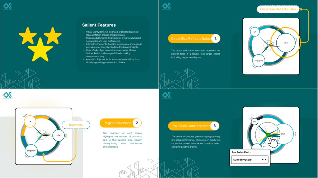
The Sales Velocity Chart stands out visually. It’s creative and highly specific, clearly designed for multi-region businesses looking to blend profit and sales views across geographies. It’s not a must-have for everyone, but we appreciate the fresh approach. You could replicate some of this with existing visuals, though not as elegantly.
The Donut Chart by JTA is another one worth watching. It adds meaningful layers to an otherwise basic visual: sentiment breakdowns, category grouping, and (we’ll say it) some genuinely impressive animations when interacting with slices. It’s rare to see a custom visual that both looks sharp and feels smooth in motion.
JTA is quietly becoming a serious player in the Power BI custom visual space. They’re building visuals that balance aesthetics, usability, and flexibility; exactly what this marketplace needs more of.
Community chatter we noticed
We always scan the comments to see what themes bubble up. A few threads popped repeatedly this month.
Text Slicer excitement and asks
Plenty of enthusiasm for having this built in, plus two common requests keep coming up
- multiple entries in one go, separated by commas
- an exact match option for tighter filtering
Microsoft folks say both are on the radar.
Mapping and regional support gaps
Azure Maps questions for government clouds and language behavior (Arabic rendering, PC language vs Power BI language) keep surfacing. The team has acknowledged both and indicated plans or backlog items. If you run into issues, log a ticket with concrete repro steps and versions.
TMDL extension and developer mode questions
A few users reported quirks in the VS Code TMDL extension with non ASCII names. The team confirmed a bug and pointed to the GitHub repo for tracking. There are also repeated questions on when PBIP and the full developer mode story will hit general availability. The guidance remains that GA is planned in the broader 2025 window with more notes expected as we get closer.
Point releases and reliability
A handful of comments mentioned download links briefly failing and a transient CALENDARAUTO circular dependency error in a November 2024 build. If you see oddities after an update, try a refresh in Desktop, then hold on your last stable version until a QFE lands. For mission critical teams, standardise on a tested monthly baseline and advance with change windows rather than day one installs.
Final Thoughts
November brings useful quality of life wins and an important push toward trustworthy, reusable metrics. Export with visual calculations closes a practical gap, the Text Slicer improves daily navigation, and Metric Sets lay the groundwork for consistent definitions across your organisation. Add the certification offer and you have a good moment to lift team capability while you tighten your semantic layer.
For the full feature list and technical detail, see the official Power BI November Feature Summary.
Ready to Transform Your Reports?
If your Power BI reports are looking basic or tired, now is the perfect time to reach out to us. Our team specializes in transforming existing Power BI assets into cutting-edge designs that match your brand and elevate your data presentation. Contact us today to discuss your project and see how we can help.
In a hurry? We have professionally crafted Power BI templates ready to go in our Template Store.