
Power BI April 2026 Feature Summary
Power BI’s April 2026 update is here, and while it’s not the most headline-stuffed release we’ve seen this year, there are a handful of genuinely useful additions tucked in alongside the usual mix of preview features and polish. With FabCon still fresh in everyone’s minds, this release feels like Microsoft tidying up behind the big announcements rather than dropping new ones, and honestly, that’s fine with us.
As always, we’ll cut through the release notes to call out what actually matters for real-world reporting.
File Picker Deprecation: Prioritised, Apparently
Starting with SU04, the old file picker experience in Power BI Desktop is officially gone. The new one’s been available since January, and this month it becomes the only option.
Look, it’s good to have a cleaner file picker. We’re not arguing against it. But we’d genuinely love to see the scoring matrix Microsoft’s Product team used to decide this warranted engineering effort while semantic model refresh reliability, theme schema gaps, and a dozen long-standing feature requests sit in the backlog. There’s a Fabric Ideas thread out there somewhere with thousands of votes that probably didn’t get this month’s treatment. File pickers don’t typically top anyone’s wishlist, but here we are. No complaints, just mild confusion about prioritisation.
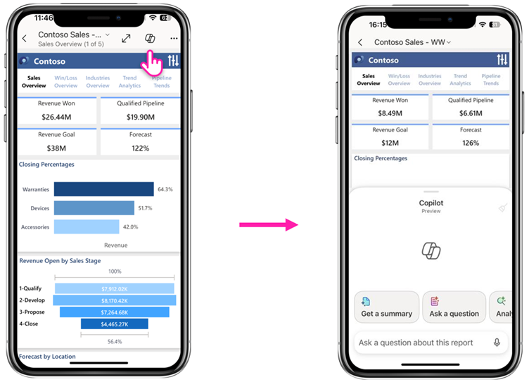
Copilot in Power BI Mobile: This One’s Genuinely Exciting
Now this is the feature we want to talk about. In-report Copilot on the mobile app has gone from a glorified “summarise this” button to a proper conversational experience. You can now have a real back-and-forth with a report from your phone. Ask about a metric, dig into what’s driving the numbers, request an AI-generated visualisation, and follow up with more questions. Every answer comes with citations back to the exact visuals Copilot used, which keeps things honest.
On iPhone and iPad, voice dictation is supported too, which turns the experience into something closer to “ask the report a question while walking into a meeting.”
This is the first Copilot feature in a while that feels like it genuinely changes behaviour rather than just being another AI-branded checkbox. Think about an ops manager on the factory floor needing a quick answer about today’s production figures, or a sales lead between meetings wanting to understand why the pipeline shifted this week. Opening the app, tapping the report, and just asking is a fundamentally different workflow than “find the filter, adjust the slicer, squint at the visual.”
The usual caveats apply: you need Copilot enabled, the right capacity, and a semantic model that’s actually been prepped for AI. Garbage in, garbage out still holds. But assuming you’ve done the groundwork, this is a meaningful step forward.
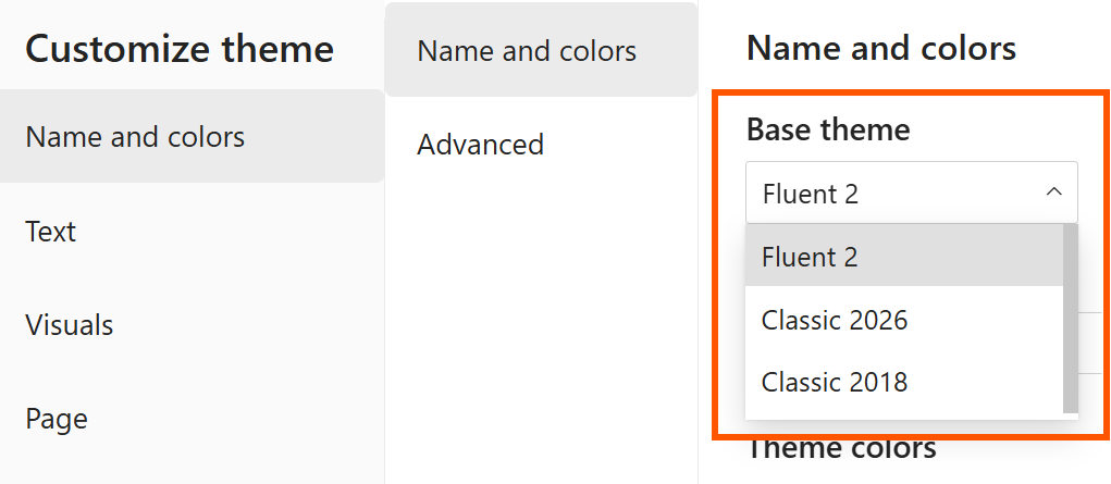
Modern Visual Defaults: Theme Switcher and Canvas Size Presets
For anyone who cares about style and consistency (guilty as charged), the theme-related updates this month are small but welcome. The Customize current theme dialog now includes a base theme switcher, which means you can roll back to the previous base theme if your custom theme doesn’t play nicely with the new modern defaults yet, or roll an older report forward to the latest base theme without starting over.
The Canvas settings now also include common page size presets for each aspect ratio, so you can stop typing 1920 x 1080 manually every time you set up a new report. Plus structural colours (background, foreground, secondaryBackground) can now be referenced in theme JSON, which is a genuinely nice touch for anyone building a proper design system.
None of this is earth-shattering, but these are the kind of quality-of-life wins we notice and appreciate.
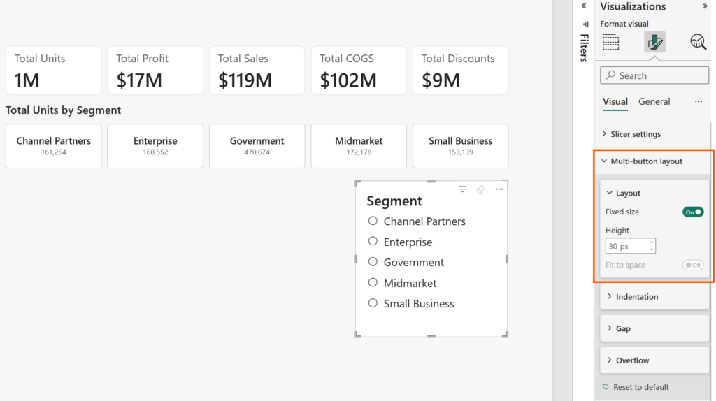
Fixed Size Layout: Finally, Finally, Finally
This is a game-changer. It shouldn’t have to be a game-changer for something this fundamental, but given how long we’ve been working around it, here we are.
Card, button slicer, and list slicer visuals now support a Fixed size option in the Layout section. Instead of specifying how many items to display and letting the visual do its own thing, you can now define the exact pixel dimensions of each card, button, or list item. The visual respects those dimensions, adds scrollbars when there’s not enough room, and stops fighting you on spacing.
Microsoft has also renamed Autogrid to Fit to space, which is a much clearer name. Fit to space on: items grow and shrink to fill the container. Fit to space off: the visual reserves space based on a set number of items. Fixed size: items stay exactly the pixel dimensions you set, regardless of container size.
For anyone building branded dashboards, which is everyone we work with, this has always been a source of pain. You design a row of KPI cards that look great at one resolution and then watch them squish or stretch awkwardly when someone views it on a different screen. This finally gives us predictable, pixel-perfect control. It’s one of those features that will quietly make your dashboards look better without anyone being able to put their finger on why.
User Context Aware Calculated Columns: A Sleeping Giant?
Calculated columns can now dynamically respond to DAX functions like USERCULTURE(), USERPRINCIPALNAME(), and CUSTOMDATA(). Microsoft’s showcase example is data translations, and it’s a genuinely compelling one, where product names in a multilingual semantic model render in Portuguese, English, or whatever locale the user’s browser is set to.
We don’t personally have an immediate use case for this, but once you start pulling on the thread, the possibilities open up:
- Regional pricing displays: show prices in local currency based on the user’s region, without building three versions of the same visual.
- Role-based column formatting: surface different levels of detail (e.g., sensitive customer info masked for non-finance users) dynamically at the column level.
- Personalised categorisation: sales reps see their own customers bucketed by their team’s logic, while regional managers see the same customers bucketed by the regional roll-up.
- Localised units of measure: imperial vs metric based on user location, without duplicating tables.
- User-specific thresholds: KPI tiers that change based on who’s looking (e.g., a store manager sees targets for their store; a regional manager sees the regional target).
This is the kind of feature that doesn’t get much press because it’s not immediately obvious what to do with it, but once the community starts playing, we expect some clever implementations. Worth keeping an eye on.
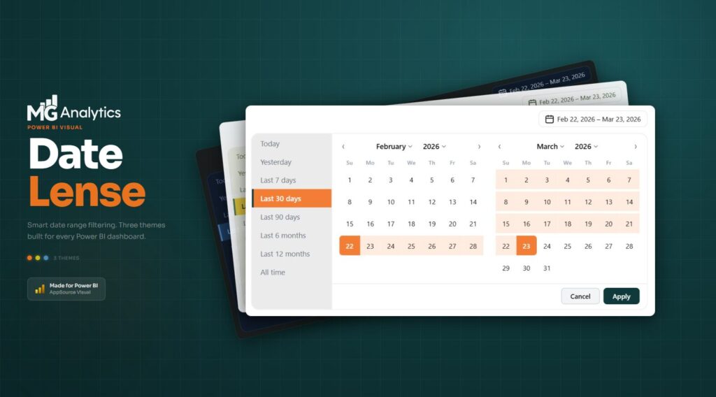
Custom Visuals: Date Picker by Powerviz… Again
And here we go. Microsoft is highlighting Date Picker by Powerviz in the Feature Summary for the… honestly, we’ve lost count at this point. Fifth? Sixth time? Let’s be clear: Date Picker by Powerviz is, without a doubt, the best custom visual we have ever seen. Best in class by a wide margin. It’s a masterpiece of design and functionality. We have nothing but respect for what the Powerviz team have built.
But it’s also expensive. Properly expensive. We’ve previously said their licensing can effectively double the cost of a Power BI Pro seat, and that hasn’t changed. For a lot of our clients, lean teams, small analytics operations, consultancies, that’s a non-starter. You can’t justify one custom visual costing more than the platform it runs on.
Which is why we built our own. Date Lens by MG Analytics delivers a polished, flexible, modern date slicer experience, and it’s a one-off lifetime licence. No recurring fees, no per-user creep, no nasty surprises at renewal time. If you’ve been eyeing Date Picker but couldn’t stomach the ongoing cost, have a look at Date Lens. We’re biased, obviously, but we built it precisely because we couldn’t find anything in the market that ticked the “great visual” and “sensible pricing” boxes at the same time.
Elsewhere in the custom visual section, Drill Down Waterfall PRO by ZoomCharts got another update. Useful if you’re in ZoomCharts’ ecosystem already, but not a game-changer this month.
Community chatter we noticed
The April update landed only a few days ago, so the comment thread is still filling up. What we’re seeing so far:
Copilot-on-mobile is generating the most genuine enthusiasm. Early community reactions are split between “this is actually useful” and “show me the bill”, which is the perennial Copilot conversation. With Copilot still requiring Fabric F64+ capacity or Premium Per User licensing, the gap between what’s technically available and what organisations can afford to deploy remains real.
Dataflows Gen1 deprecation is stealing the oxygen. Worth mentioning because it’s dominating Power BI community discussion right now. Microsoft’s announcement about retiring Dataflows Gen1 generated so much pushback that they published an update post specifically to clarify their position, including walking back on certain points and committing to more granular Fabric controls. The community made noise, Microsoft listened. Good.
The fixed size layout is getting quiet, grateful nods. Nobody’s running a parade in the streets, but we’ve seen multiple “about time” reactions from designers and consultants who’ve been fighting the old autogrid behaviour for years.
Date Picker fatigue. We’re not the only ones noticing. The Powerviz visual is excellent, genuinely, but its repeated appearances in feature summaries haven’t gone unnoticed.
Final Thoughts
April’s update is a quieter month by design. FabCon hoovered up the headline announcements, and this release focuses on incremental polish and preview expansion. But that doesn’t mean it’s unimportant. Fixed size layouts fix a long-standing pain point for anyone who cares about design quality. Copilot on mobile is the first Copilot feature in a while that feels like it might actually change how people work. And user context aware calculated columns quietly opens up a whole new category of personalisation scenarios that the community will have fun exploring.
If you’re a report designer who values consistency and brand integrity, there’s enough in this release to matter. If you’re building mobile-first experiences for your executives, Copilot just got a serious upgrade. And if you’ve been waiting for Microsoft to finally let you control card sizes properly, April 2026 is your month.
For the full feature list and technical detail, see the official Power BI April Feature Summary.
Ready to Transform Your Reports?
If your Power BI reports are looking basic or tired, now is the perfect time to reach out to us. Our team specializes in transforming existing Power BI assets into cutting-edge designs that match your brand and elevate your data presentation. Contact us today to discuss your project and see how we can help.
In a hurry? We have professionally crafted Power BI templates ready to go in our Template Store.