
Power BI February 2026 update: the stuff we will actually use
The February 2026 Power BI Feature Summary is a quality month. Not flashy, but packed with usability wins that help teams move faster, especially around filtering, slicing, and report interaction.
Input Slicer is now generally available
If you have ever built a fake search box using bookmarks, measures, and a lot of patience, this one lands nicely. The Text Slicer has graduated and is now officially the Input Slicer, with more filter modes, slicker formatting, wildcard style behaviour, and support for multiple entries.
We have used text input patterns for years to replicate search inside dashboards, so we are genuinely happy to see this go mainstream. It is one less custom workaround to maintain, and one more feature that feels like it belongs in core Power BI.
The one bummer: it still cannot search across multiple fields at once. If you want a single search box that can hit Customer, Account, and Email together, you are still looking at modelling tricks or custom patterns. It still looks mint, though.

Paste into any slicer is a real time saver
This is one of those features that sounds small, but adds up quickly. You can paste a list of values directly into a slicer and Power BI will match and select them. That means less clicking, less scrolling, and fewer errors when someone sends you a list in Excel or an email.
Also worth calling out: we like that the paste action selects items rather than changing the slicer list itself. It is a subtle UX choice, but it makes the feature feel safe.
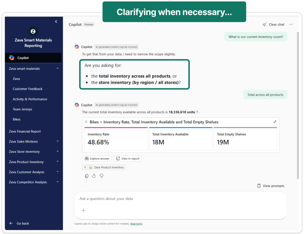
Copilot gets more conversational
Copilot continues to evolve, and the February update pushes it further toward becoming the main way people interact with Power BI.
Inside Power BI apps, Copilot is now more conversational. Instead of selecting a report first, you can simply ask a question and Copilot will scan the app, find the most relevant report, and return the answer. If multiple reports could match, it will ask a quick clarifying question before responding.
App summaries are also new. You can ask Copilot what reporting exists inside an app and it will generate a quick overview of available reports, which should help users discover content faster.
Two smaller but important changes: the Copilot prompt limit has jumped from 500 to 10,000 characters, and Fabric Copilot capacities are now enabled by default at the tenant level.
Our take: this direction makes sense. The more Copilot can guide users to the right report or insight, the less they need to understand the underlying report structure. Just remember that good semantic models and clear report descriptions matter more than ever.
Azure Maps feels noticeably faster
We saw a massive improvement in Azure Maps load times, and Microsoft calls out performance work specifically for Azure Maps visuals with pie charts, with faster rendering starting in this release.
This is exactly the kind of investment we love. When maps load quickly, people actually use them. When they do not, they get removed from pages.
The quiet modeling win
For the DAX crowd, TABLEOF and NAMEOF are a meaningful step toward more resilient DAX, especially when you care about refactoring, reuse, and safer references.
Card visual updates are a welcome addition
The new Card visual keeps getting better. This month, Microsoft lifted the default callouts from 5 to 10, which makes the visual feel far more usable out of the box for KPI heavy pages. Even better, when you use categories in the Card visual, clicking a category now cross filters the rest of the page. That is genuinely cool. It turns what used to be a passive KPI tile into an interactive navigation surface, which is exactly how modern summary pages should behave.
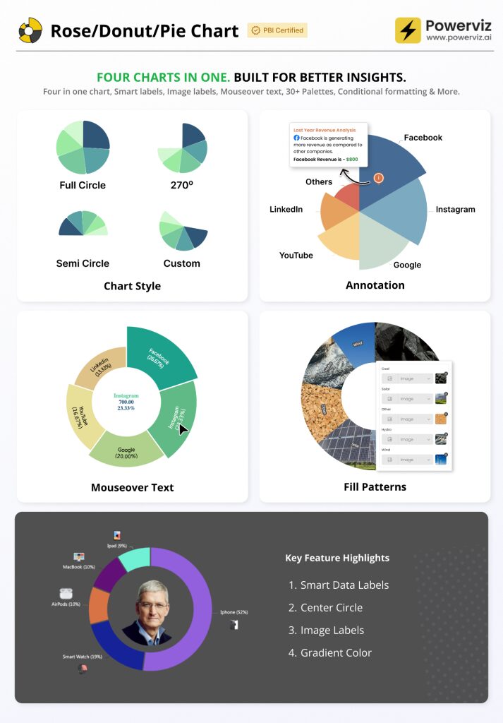
A quick shout out to Powerviz (again)
The Rose Donut Pie Chart by Powerviz is very slick. Modern look, strong options, and it is rare to see a custom chart feel both polished and flexible without turning into a formatting rabbit hole. We have seen this doing the rounds on LinkedIn and we get the hype.
Community chatter we noticed
A couple of themes kept popping up as people started testing the release.
Input Slicer edge cases and rough spots
There is still some community noise around Input Slicer behaviour in real reports, including cases where it does not reset cleanly with bookmarks. If you rely heavily on bookmark driven experiences, keep an eye on this before you roll it out everywhere.
General sentiment
The vibe we saw was mostly positive on the practical productivity upgrades, with the occasional take that the release is more incremental than exciting. That feels fair, but we will take workflow wins every month.
Final Thoughts
February is a usability release, and that is a compliment. Input Slicer going GA and paste into slicers are both features you will feel every week. Add the Azure Maps performance boost and a genuinely impressive Powerviz visual, and you have a month that improves the day to day experience for both authors and consumers.
For the full feature list and technical detail, see the official Power BI February Feature Summary.
Ready to Transform Your Reports?
If your Power BI reports are looking basic or tired, now is the perfect time to reach out to us. Our team specializes in transforming existing Power BI assets into cutting-edge designs that match your brand and elevate your data presentation. Contact us today to discuss your project and see how we can help.
In a hurry? We have professionally crafted Power BI templates ready to go in our Template Store.