
Power BI March 2026 Feature Summary
The Power BI March 2026 update lands alongside FabCon and continues a strong run of practical improvements. This month is less about headline features and more about tightening the experience for report authors and consumers.
There is a clear focus on usability, consistency, and bridging the gap between analytics and action. A few features in particular stood out to us as genuinely impactful.
Translytical task flows are now generally available
This is the big one.
Translytical flows move Power BI beyond pure reporting and into action. Users can now update data, trigger workflows, or push changes back into systems directly from a report.
Why this matters: this closes the loop. Instead of identifying an issue in a dashboard and jumping into another system to act on it, users can do both in one place. Sales teams updating discounts, ops teams annotating data, approvals flowing into Teams. This is where Power BI starts to feel like an operational platform, not just a reporting layer.
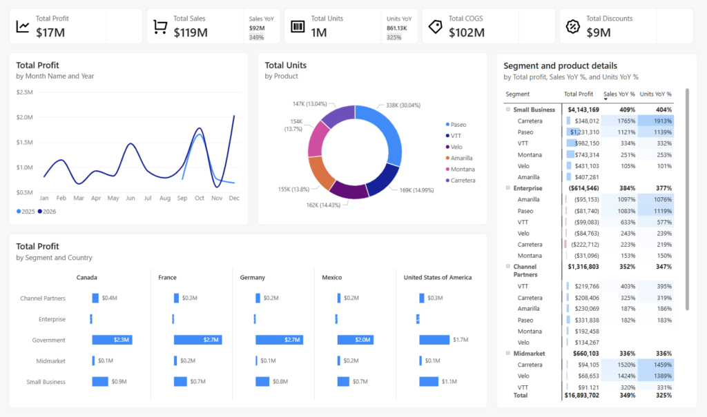
Modern visual defaults and themes (Preview)
We love this. This is exactly the direction the platform needs.
Out of the box visuals now come with better spacing, typography, padding, and general layout consistency. Buttons look like buttons. Slicers behave more predictably. The base theme feels far more polished.
Why it matters: most reports still suffer from inconsistent design. This reduces the effort required to produce something clean and professional and lifts the baseline across the ecosystem.
For teams like ours that care about branding, spacing, and consistency, this is a huge step forward. Less time fixing defaults, more time delivering value.
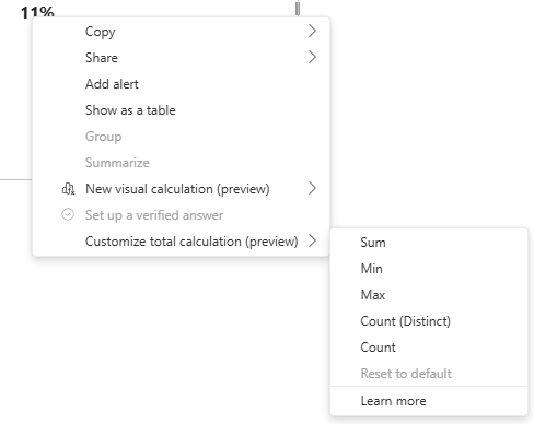
Custom totals (Preview)
Finally.
Custom totals give authors control over how totals behave in tables and matrices without rewriting measures. You can now define totals like Sum, Min, Max, or distinct counts at the visual level.
Why it matters: anyone who has worked with non additive measures knows the pain. Totals not matching expectations, workarounds in DAX, confused stakeholders.
This is a breath of fresh air. Particularly useful for distinct counts and scenarios where business users expect totals to behave differently to pure DAX logic.
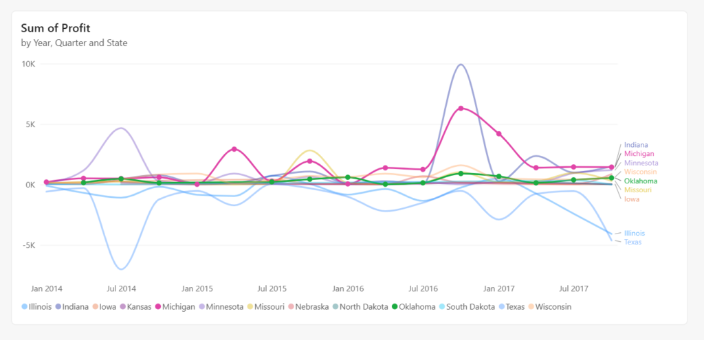
Line chart improvements with leader lines
A small change that makes a big difference.
Leader lines help connect labels to the correct series in dense visuals. You also get more control over styling and layout.
Why it matters: readability. Line charts can get messy quickly, especially with multiple series. This improves clarity without requiring redesign.
TMDL view in the web (Preview)
A very smart addition.
TMDL in the browser brings a code first modeling experience directly into the web interface. You can script, review, and update semantic models without switching to Desktop.
Why it matters: this is a big win for developers and teams working in more mature CI CD setups. It lowers friction and opens the door for more consistent, repeatable model management.
Input slicer keeps getting better
We started using the input slicer as a search bar last month, and it is already proving useful.
This month adds conditional formatting across elements like text, borders, icons, and accent bars.
Why it matters: last month it felt slightly incomplete. This rounds it out. You can now guide users visually and integrate the slicer more cleanly into your report design.
Direct Lake in OneLake is now generally available
Another significant milestone in this release.
Direct Lake in OneLake moves out of preview and into general availability, meaning you can now query data directly from OneLake storage without import or DirectQuery trade-offs. You get the speed of import mode with the freshness of DirectQuery, with no data duplication and no scheduled refreshes.
Why it matters: for teams working at scale with large semantic models, this removes one of the most common architectural headaches. Data lives in OneLake, Power BI reads it directly, and performance stays fast. It is a foundational change for organisations building on Microsoft Fabric, and GA status means it is now production-ready.
Custom visuals we’re eyeing
Not much to get excited about this month.
There is a sense of recycling in the custom visuals space again. A few interesting concepts, but nothing that feels genuinely new or essential.
The Powerviz Sankey is solid and flexible, but we have seen similar approaches before. ZoomCharts continues to refine pie and donut experiences, though again, not breaking new ground.
Overall, still waiting for more innovation in this space.
Community chatter we noticed
A few themes popped up this month.
Modern visuals getting attention
There is strong positive feedback around the new defaults. Many are calling out how much cleaner reports look with less effort. Some early feedback around wanting more control over presets and migration paths for existing reports.
Custom totals confusion (and excitement)
A mix of excitement and questions. People love the flexibility, but there is already discussion around when to use custom totals versus standard DAX behavior. Expect this to be a learning curve for teams.
Input slicer adoption growing
More teams are experimenting with it as a search experience. Common asks include multi value input and tighter matching options.
Translytical flows curiosity
A lot of interest, but also questions around governance, writeback patterns, and performance. This will likely take time to mature in real world implementations.
Final Thoughts
Power BI March 2026 is a strong, practical release.
Translytical flows push Power BI further into operational analytics. Modern visual defaults lift the baseline for report design. Custom totals solve a long standing pain point. And the input slicer continues to evolve into a genuinely useful interaction pattern.
Individually, these are incremental. Together, they move the platform forward in a meaningful way.
For teams focused on clean design, consistent experiences, and actionable analytics, this is a very welcome update.
For the full feature list and technical detail, see the official Power BI March Feature Summary.
Ready to Transform Your Reports?
If your Power BI reports are looking basic or tired, now is the perfect time to reach out to us. Our team specializes in transforming existing Power BI assets into cutting-edge designs that match your brand and elevate your data presentation. Contact us today to discuss your project and see how we can help.
In a hurry? We have professionally crafted Power BI templates ready to go in our Template Store.