The May 2026 Power BI update is one of those releases that probably won’t generate screaming YouTube thumbnails, but for people building polished, enterprise-grade reporting experiences every day, there’s actually a lot to like here.
This month feels heavily focused on refinement. Better formatting control. Better consistency. Better usability. Better self-service experiences. Less friction.
And honestly, those are often the updates that matter most long term.
There are several features in this release that we immediately started using, particularly around formatting, layout consistency, and report exploration. It’s also good seeing Microsoft continue investing heavily in the Input Slicer after finally making it a first class citizen in recent months.
For the full technical breakdown, check out Microsoft’s official May 2026 Feature Summary.
- Perspectives are a huge win for self-service analytics
- Set as Landing Page is one of those tiny features we absolutely love
- Default locale formatting finally fixes a long standing frustration
- Input Slicer keeps getting stronger
- Fixed column widths are a massive design improvement
- The new Get Data experience feels modern
- Pasting formatted text from Word is oddly satisfying
- Good to see OKViz back
- Community chatter we noticed (so far)
- Final Thoughts
- Ready to transform your reports?
Perspectives are a huge win for self-service analytics
This is probably the standout feature of the month for us. If you’ve ever exposed a large semantic model to business users and watched them drown in a giant list of tables and fields, you’ll immediately understand why Perspectives matter.
Power BI now lets you define an Explore Perspective for reports, giving users a cleaner and more curated set of fields when they launch Explore.
Why this matters:
• Cleaner self-service experiences
• Reduced confusion for business users
• Better governance without separate datasets
• Easier navigation through large models
• Less chance of users building nonsense visuals from technical tables
This is effectively UX for semantic models, and it’s badly needed in enterprise Power BI deployments. Most mature models become bloated over time. Perspectives finally let you present a business-friendly version of your model without rebuilding everything from scratch.
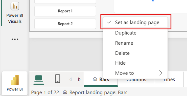
Set as Landing Page is one of those tiny features we absolutely love
This is now Generally Available and honestly, thank you Microsoft. You can now officially define any report page as the landing page.
Which means no more:
• publishing from the wrong page
• quickly navigating back to page one before deployment
• users landing halfway through a report by accident
It sounds small, but it removes one of those annoying little deployment rituals Power BI developers have dealt with for years. A genuine quality of life improvement.
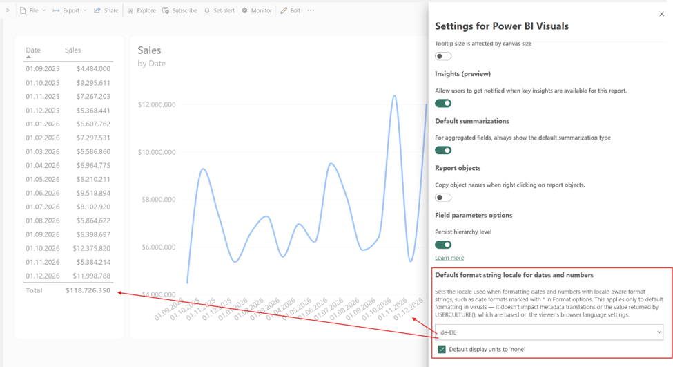
Default locale formatting finally fixes a long standing frustration
This one got a very loud “finally” from us. You can now set report-level locale formatting for dates and numbers regardless of the viewer’s browser settings.
That means:
• Australian dates stay Australian
• decimals remain consistent
• formatting behaves predictably across regions
No more stakeholders questioning whether a report is wrong because 04/05/2026 means something different in another country. For global organisations and embedded reporting scenarios, this is a really important improvement.
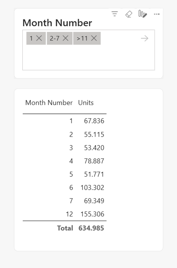
Input Slicer keeps getting stronger
Microsoft clearly sees the Input Slicer as a strategic visual now, and we’re very happy about that. We’ve been using it as a “search bar” experience in our reports for quite some time now, so it’s nice seeing continuous investment.
This month brings numeric column support and it’s now Generally Available.
You can now support syntax like:
• >100
• <500
• 1-10 ranges
• direct numeric entry
It’s a very welcome enhancement. We still badly want multi-field searching eventually though. That remains the missing piece.
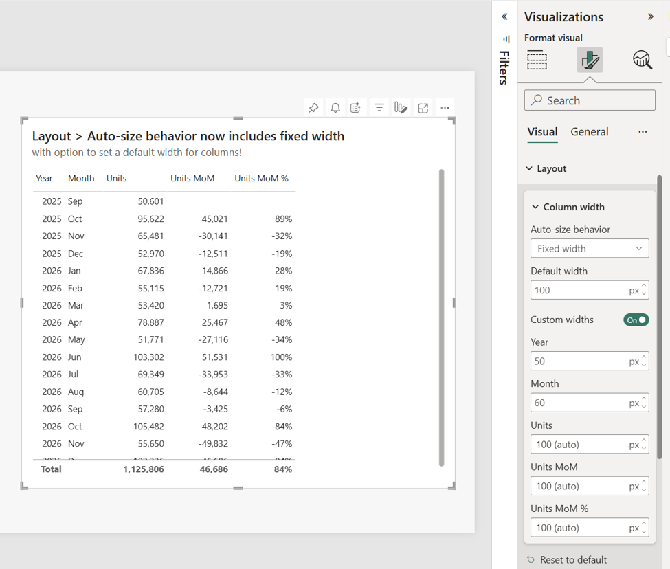
Fixed column widths are a massive design improvement
We rushed to implement this when it first hit preview, so we’re thrilled seeing it now Generally Available. You can now define exact pixel widths for table and matrix columns.
For teams who care deeply about polished dashboard design and pixel-perfect layouts, this is huge.
Previously, auto-sizing could create:
• awkward spacing
• inconsistent layouts
• messy mobile experiences
• unpredictable resizing
Now we finally get precise control. This is especially important for executive dashboards and embedded reporting experiences where presentation quality matters just as much as the data itself.
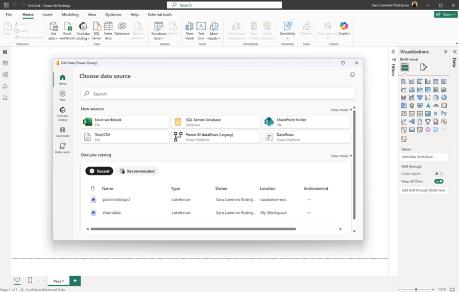
The new Get Data experience feels modern
The redesigned Get Data experience in Power BI Desktop genuinely feels cleaner and more modern.
And yes, developer experience matters.
Modern tooling creates confidence. It makes Power BI feel alive and evolving rather than stuck in legacy UI patterns.
We particularly liked:
• the cleaner navigation
• better accessibility support
• improved consistency with Fabric and Excel
• the overall smoother experience
It’s not revolutionary, but it absolutely feels like a step forward.
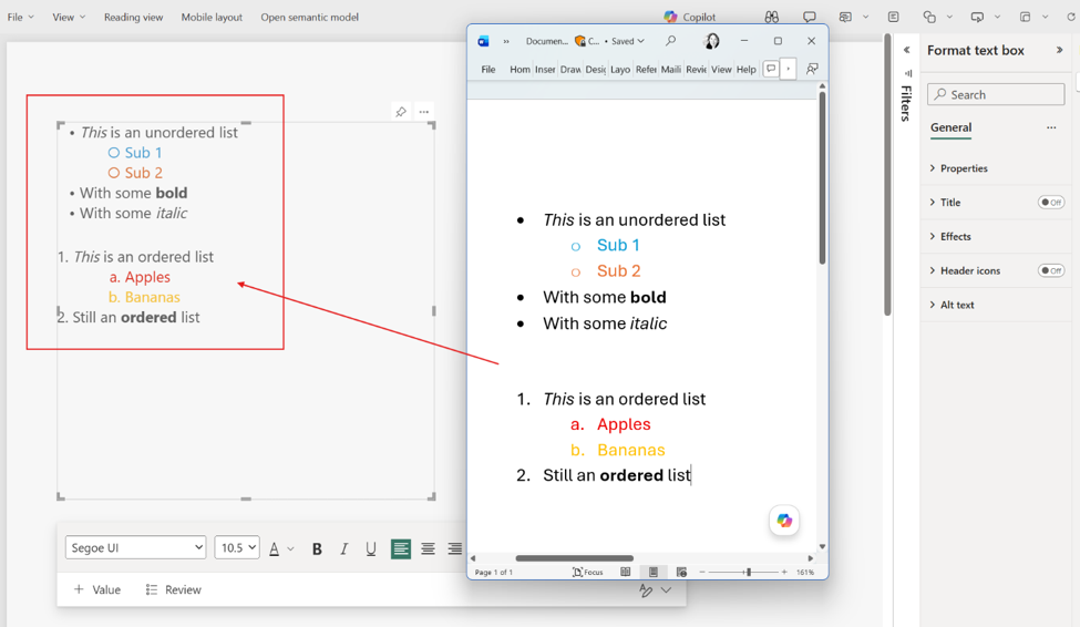
Pasting formatted text from Word is oddly satisfying
This sounds incredibly minor until you actually use it.
Power BI text boxes now preserve formatting correctly when pasting lists from Word.
Bullets work properly. Indentation behaves correctly. Lists render as expected.
If you build polished executive reporting or operational reporting with embedded instructions and commentary, this is genuinely useful.
Less fighting with formatting is always appreciated.
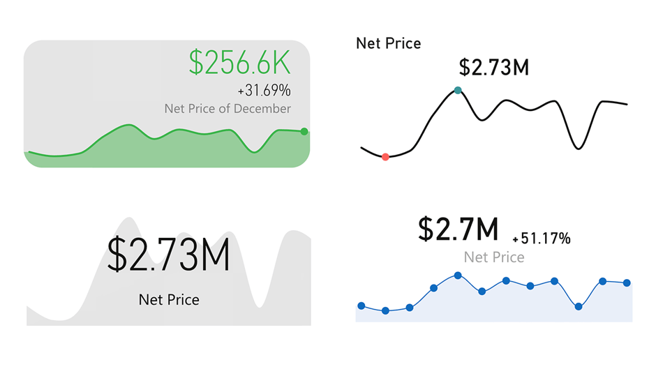
Good to see OKViz back
One of the more pleasant surprises this month was seeing OKViz return with the new Card with States visual.
We’ve always liked OKViz because they generally avoid over-designed gimmicks and instead focus on:
• clean layouts
• subtle styling
• readability
• modern aesthetics
Basically, visuals that look professional rather than “look what Power BI can do”.
The refreshed Card with States visual keeps that same minimalist and sexy design philosophy intact. Also very nice seeing all features unlocked without licensing restrictions.
Community chatter we noticed (so far)
A few themes kept surfacing in the community discussion around this release.
Perspectives got immediate attention
A lot of enterprise model developers immediately recognised the value of Perspectives for Explore. The general reaction was essentially:
“Finally, a way to make self-service safer without killing flexibility.”
Which honestly sums it up pretty well.
Input Slicer requests continue
The Input Slicer momentum continues strongly. Numeric support was very well received, but the same request keeps appearing: multi-column search support.
People clearly want this visual to evolve into a true report-wide search experience.
Design-focused developers loved fixed widths
There was surprisingly strong excitement around fixed column widths.
But honestly, we get it.
Anyone building pixel-perfect dashboards knows how frustrating Power BI’s auto-sizing behaviour could be. This feels long overdue.
The new Get Data experience split opinion slightly
Most people agreed it feels cleaner and more modern.
Some long-time users naturally dislike UI changes that break muscle memory, but overall the sentiment seemed positive.
Final Thoughts
May 2026 is a refinement release, and we mean that in the best possible way.
There may not be one giant headline feature dominating the update, but there are dozens of practical improvements that make Power BI feel more polished, more professional, and more enterprise ready.
Perspectives are the clear standout for us.
But we also genuinely appreciate:
• Landing Pages going GA
• Locale formatting controls
• Fixed pixel column widths
• Continued Input Slicer investment
• Better formatting experiences
• Modernised Desktop UX
This release feels very aligned with where Power BI is heading: cleaner, smarter, more polished analytics experiences with stronger self-service governance and better design consistency.
And as people obsessed with branding, layout consistency, spacing, fonts, and polished report experiences… that’s exactly the direction we want to see.
Ready to transform your reports?
If your Power BI reports are looking basic or tired, now is the perfect time to reach out to us. Our team specializes in transforming existing Power BI assets into cutting-edge designs that match your brand and elevate your data presentation. Contact us today to discuss your project and see how we can help.
In a hurry? We have professionally crafted Power BI templates ready to go in our Template Store.