
The January 2026 Power BI Feature Summary is a quieter, post holidays release, but it still lands a few meaningful changes. The headline is Q&A getting a retirement date, plus a handful of quality of life improvements that feel like Microsoft smoothing over rough edges from earlier updates.
Deprecation of Power BI Q&A
Power BI Q&A will be deprecated in December 2026, with Microsoft steering everyone toward Copilot as the long term natural language experience. That direction makes sense. Q&A has always been a bit fragile unless your model is perfectly curated and heavily maintained.
Our take: Copilot is the right replacement, but it raises the bar on governance. If you want reliable answers, your semantic layer needs to be clean, well described, and properly managed. This is less about turning AI on and more about earning trust through modeling standards.
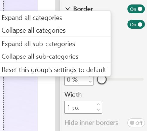
Format pane improvements
Two small updates that genuinely help day to day report building.
Improved color picker: clearer theme selection, easier switching between theme and custom colors, and a better path back to defaults.
Granular reset: you can now reset formatting at a group level instead of wiping the entire visual.
It is not glamorous, but it saves time and reduces the fiddly formatting pain that most teams quietly hate.
Fixing past updates
January also continues a pattern we have seen lately. Features ship, feedback rolls in, and Microsoft adjusts.
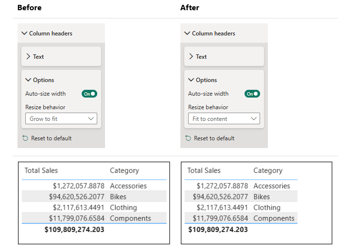
Column sizing is a good example. Auto expanding columns was introduced recently, and plenty of people disliked how it stretched small fields and made layouts feel inconsistent. Now new reports default back to content sized columns, with Grow to fit available when you actually want it.
This is the right move. It also reinforces that some recent release notes are less about new capability and more about tuning what shipped earlier.
Third party visuals feel a little light
The showcase this month includes Powerviz again, plus Nebula by BI Samurai.
Nebula is the one worth mentioning. It is a layout and background design visual aimed at bringing structure and consistency to report pages inside Power BI. We like the intent. Standards and uniformity are desperately needed in the ecosystem.
That said, this is very close to what we specialise in. We build strong design systems, reusable layouts, and polished report structure as part of our core work. Nebula looks like a handy tool for teams that want a shortcut to that discipline, and it is good to see Microsoft certified visuals pushing that direction.
Community chatter we noticed
Early commentary on this release is fairly calm. The themes we keep seeing are:
Copilot replacing Q&A feels inevitable, but some teams want clear guidance on how to manage trust and governance.
The format pane tweaks are getting a quiet thumbs up because they remove friction.
The column sizing change is broadly welcomed as a correction.
Final Thoughts
January feels light, but that is expected. It is a tidy up month with one major direction call. Copilot keeps taking ground, Q&A gets its sunset window, and the rest is quality of life work that helps creators move faster with less frustration.
For the full feature list and technical detail, see the official Power BI January Feature Summary.
Ready to Transform Your Reports?
If your Power BI reports are looking basic or tired, now is the perfect time to reach out to us. Our team specializes in transforming existing Power BI assets into cutting-edge designs that match your brand and elevate your data presentation. Contact us today to discuss your project and see how we can help.
In a hurry? We have professionally crafted Power BI templates ready to go in our Template Store.