
The July 2026 Power BI update is here, and it is a decidedly quieter release than June. There are no headline AI announcements, no new agent skills, no MCP news. What we have instead is a batch of practical formatting refinements, some meaningful modeling parity between Desktop and the web, and org apps continuing their steady maturation.
That is not a criticism. After June’s agentic reporting bombshell, a breather makes sense. And there is a lot in this release we are genuinely happy about, particularly a couple of visual polish items that have been quietly annoying us for years.
As always, here is what caught our attention this month.
For the full technical breakdown, check out Microsoft’s official July 2026 Feature Summary.
- Simplified title spacing for visuals
- Measure descriptions with triple-slash comments (finally)
- Report page tab navigation, finally less painful
- Conditional formatting for line charts and legends (GA)
- Modeling and web parity continues
- Org apps keep maturing
- Custom visuals we are eyeing
- The AI and MCP silence
- Community chatter we noticed
- Final Thoughts
- Ready to transform your reports?
Simplified title spacing for visuals
This is a small change with a big quality-of-life impact for anyone who builds polished reports. Title spacing has been reworked to use a consistent “space above” approach: Space above subtitle, Space above divider, Space above plot area. No more mental gymnastics figuring out whether a gap is controlled by “space below the title” or “space above the divider.”
Your existing reports adjust automatically without any visual change. If you have title spacing configured in a custom theme, Microsoft recommends updating it to use the new “space above” properties, which we agree with. It is a rare formatting update that immediately makes life easier without needing to relearn anything.
Measure descriptions with triple-slash comments (finally)
This one has been a long time coming. Until this release, adding a measure description was a two-step process: author your measure in DAX query view, then switch over to Model Explorer to type the description in separately. That workflow friction meant descriptions often just didn’t get written.
Now you can add measure descriptions right where you write your measures, using the same triple-slash (///) syntax that TMDL already supports:
DEFINE
    /// Year-over-year sales growth, as a percentage.
    /// Returns BLANK when there is no prior-year value.
    MEASURE Sales[YoY Growth %] = ...
Select “Update model with changes” and the description gets written straight into the model alongside the measure definition. It travels with the measure everywhere: hover in DAX query view, Model Explorer, or the Data pane, and the description appears in the tooltip.
For teams managing large semantic models, this is exactly the kind of authoring flow that should have existed from day one. It also pairs nicely with Copilot’s automated measure description feature from last year, so there is now a proper end-to-end story for keeping models self-documenting.
Report page tab navigation, finally less painful
If you have ever tried to drag a page tab from the end of a large report to the beginning, you already know why this matters. Previously, you couldn’t scroll past the visible tabs while dragging, which turned a simple reorder into a multi-step ordeal of dragging, releasing, scrolling, and dragging again.
Now, when you drag a page tab toward the edge of the tab bar, the tabs continue to scroll until you reach the position you want. The arrow buttons are also more precise. It is one of those small changes that will save 30 seconds a day for anyone who works on 20+ page reports, which adds up to real time over a year.
Conditional formatting for line charts and legends (GA)
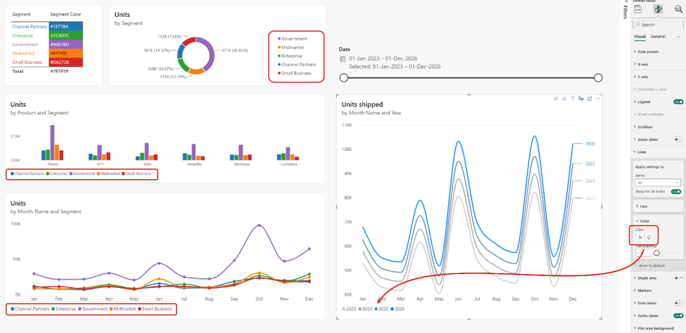
This is one of the biggest wins in the release. Conditional formatting has extended to line charts and to any visual with a legend, meaning bar charts, column charts, pie charts, donut charts, and line charts can now be conditionally formatted when they have a legend.
The use cases are excellent. Overlay multiple years of data on a line chart and gradient-format them so the most recent year pops in blue while older years fade to grey. Use a single DAX measure to color a segment consistently across every visual in your report; change the measure once and every visual updates instantly. Markers and series labels inherit the conditional formatting automatically until you decide to override them.
For anyone who values brand consistency and design coherence across a report, this is a huge unlock. It removes a whole class of “how do I get these five visuals to show the same category in the same colour” hacks that we have all built over the years.
Modeling and web parity continues
The July release keeps closing the gap between Power BI Desktop and web modeling. The Model Options dialog is now available directly in the Power BI Service, meaning you can configure things like type detection, relationship auto-detection, parallel loading, locale, and DirectQuery gates without switching to Desktop. TMDL View also lands on the web, giving developers a code-first modeling experience directly in the browser for scripting bulk edits and applying changes at scale.
None of this is groundbreaking on its own, but the cumulative effect matters. The days of “you can only really model in Desktop” are numbered.
Org apps keep maturing
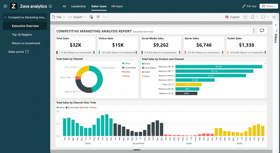
Org apps with audiences went generally available in July, and Microsoft is clearly serious about making this the recommended way to distribute Power BI content. Bookmarks now work in org apps (both author-created and personal), Storytelling in PowerPoint is supported, and audiences extend to mobile so users on iOS and Android see content curated to their role. CRUD REST APIs also landed for both org apps and paginated reports, which opens up automation and lifecycle management for teams operating at scale.
If you have been holding off on adopting org apps, the case to move is getting stronger every month.
Custom visuals we are eyeing
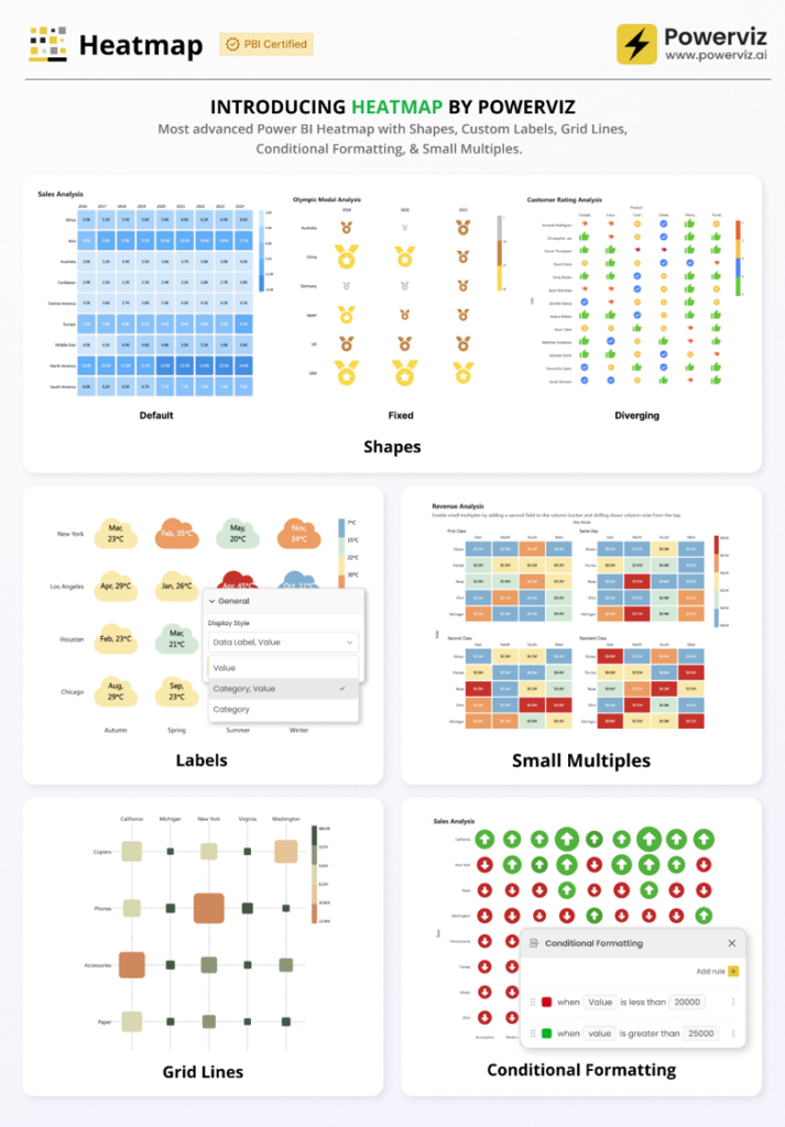
Heatmap by Powerviz is another slick, well-executed release in Powerviz’s signature style. Custom shapes, 30+ palettes with colour-blind mode, small multiples, conditional formatting with value, percentage, and ranking rules, plus grid view and sorting. Powerviz continues to set the bar for what a custom visual should look and feel like. Our usual caveat applies: the licensing cost remains steep, and for a lot of our clients that is still a hurdle. But the craft on display is undeniable.
Zebra BI Tables added a genuinely useful feature: neutral variance colour. You can now define a tolerance zone where small variances stay neutral rather than lighting up red. Revenue 3% below plan when your acceptable range is ±5%? Stays neutral. Drops to -7%? Turns red. This is exactly the kind of thoughtful improvement that IBCS-aligned reporting has needed for years.
Drill Down Scatter PRO by ZoomCharts got another update, with over 200 formatting options, dynamic regression lines, lasso selection, and area highlighting. Solid if you are already in the ZoomCharts ecosystem.
The AI and MCP silence
Worth calling out: this release is notably light on AI and Copilot. After June’s massive agentic reporting drop, we half-expected July to keep the momentum going with follow-up capabilities, MCP updates, or new Copilot skills. Instead, nothing.
Two ways to read this. Either Microsoft is deliberately pacing themselves after a big month, or the AI push has hit a natural pause while they consolidate feedback from the June release. Either way, it is a noticeable gap in a year that has otherwise been AI-heavy month after month. We are curious to see whether August brings the acceleration back or whether this is a broader shift in cadence.
Community chatter we noticed
A few themes are emerging in the early conversation around this release.
Conditional formatting for line charts and legends is getting the most love. It has been on the community wishlist for a long time, and general availability landed well. Multiple designers have already shared examples of gradient line charts and consistent segment colouring across visuals.
Measure descriptions with triple-slash comments generated quiet approval. The people who care about this feature really care about it, and they are relieved it has finally shipped.
The lack of AI news has not gone unnoticed. A few comments observed that this month felt like a “catch your breath” release, which lines up with our read.
Final Thoughts
July 2026 is not going to be remembered as a landmark release, and that is fine. Not every month can be June. What we have here is a thoughtful batch of polish, meaningful modeling parity between Desktop and web, and an org apps story that keeps getting stronger.
The standouts for us:
- Simplified title spacing making visual formatting less confusing
- Measure descriptions with triple-slash comments removing a long-standing workflow annoyance
- Conditional formatting for line charts and legends unlocking real design consistency across reports
- Page tab reordering finally working properly
- Org apps continuing to mature into the recommended distribution model
For anyone who builds Power BI reports for a living, this release quietly removes several small frictions that have been chipping away at productivity for years. That is worth celebrating, even if the headlines are elsewhere.
Ready to transform your reports?
If your Power BI reports are looking basic or tired, now is the perfect time to reach out to us. Our team specializes in transforming existing Power BI assets into cutting-edge designs that match your brand and elevate your data presentation. Contact us today to discuss your project and see how we can help.
In a hurry? We have professionally crafted Power BI templates ready to go in our Template Store.