
The June 2026 Power BI update is a release with a bit of everything. There are some genuinely big-picture AI announcements, a healthy batch of practical reporting refinements, and a few modeling upgrades that serious developers have been waiting on for a long time.
What stands out to us this month is the direction of travel. Microsoft is clearly leaning hard into agentic experiences, where you describe what you want and tooling does the heavy lifting. But alongside all the AI noise, there are plenty of quiet, useful improvements to the visuals and formatting we touch every single day.
As always, we have already started playing with several of these, particularly the reporting and formatting features. Here is what caught our attention.
For the full technical breakdown, check out Microsoft’s official June 2026 Feature Summary.
- Agent skills are turning report building into a conversation
- Copilot in web modeling is a smart addition
- The date picker for slicers fixes a recurring chore
- Matrix and table improvements keep coming
- Plenty of visual formatting wins
- Shape map and Azure map upgrades
- DAX user-defined functions go generally available
- Developer and platform updates worth noting
- Community chatter we noticed (so far)
- Final Thoughts
- Ready to transform your reports?
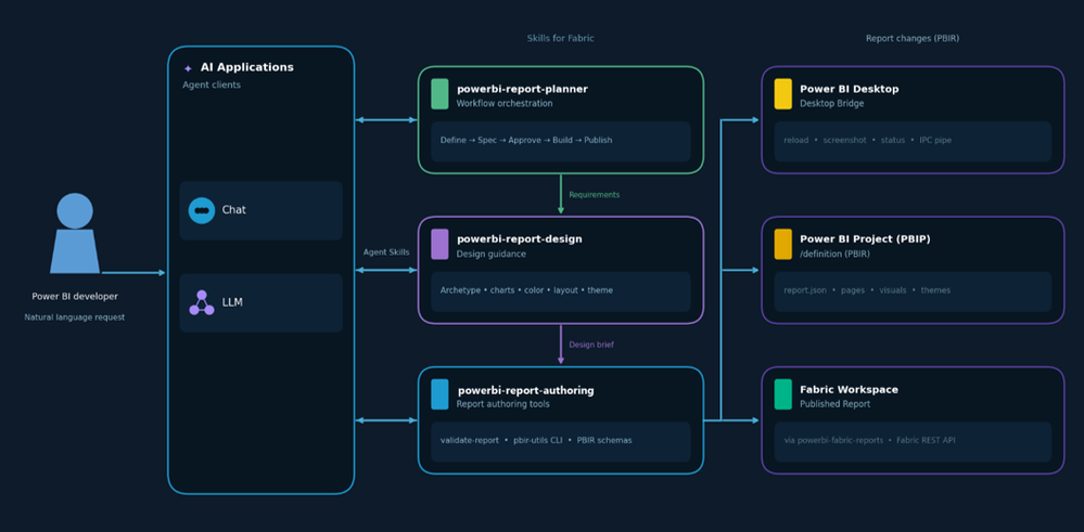
Agent skills are turning report building into a conversation
This is the headline shift for us this month. Power BI report authoring is now available as a set of agent skills, letting you design, build, validate, and publish reports through natural language rather than clicking through every step yourself.
Why this matters:
- You can go from a vague brief to an approved report spec through guided questions
- Design recommendations are grounded in real data visualisation best practices
- Desktop reloads and captures screenshots automatically so you can review live results
- Finished reports can be published straight to a Fabric workspace from the terminal
- The whole pipeline runs across plan, design, author, validate, and publish stages
It currently only works with local PBIP files, so it is early days. But the ambition here is obvious, and it points to where report development is heading. We are watching this one very closely. Truth be told, we have been solving exactly this problem for a while now using Claude Cowork paired with a Power BI MCP Server, and deliciously so, but we are keen to see the native tooling in action.
Copilot in web modeling is a smart addition
Rolling out this month, Copilot in web modeling lets you analyse and improve semantic models using plain language directly in the service. You can ask it to flag inconsistent naming or unclear structure, rename tables and columns, create relationships, and generate measures.
For anyone who maintains large models, removing some of that manual editing grind is genuinely welcome. The fact that it lives in the browser means you are no longer tied to Desktop just to tidy up a model.
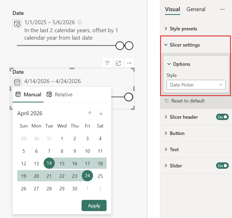
The date picker for slicers fixes a recurring chore
This one earned an immediate nod of approval from us. The new date picker option for slicers removes the tedious task of manually updating date selections every reporting period.
What we like about it:
- Set a relative default and it rolls forward automatically as data refreshes
- Viewers are not locked in and can pick their own range or single date
- Selections stay data-aware by anchoring to today or the first or last date of your data
- The compact control clearly shows the current range and flags selections outside available data
No more revisiting reports every month or quarter just to nudge a date slicer. It is currently in preview, so you will need to enable it under Options then Preview features.
Matrix and table improvements keep coming
The matrix visual now has auto-expand settings for row and column headers, so new hierarchy levels can appear expanded by default rather than collapsed. This is especially handy for reports using Personalize this visual, where viewers adding their own fields previously had to click through every level manually.
On top of that, tables and matrices now support conditional formatting for custom column widths. By binding width to a What-If parameter and adding a slider or button, you can hand users direct control over column sizing. It is a creative little capability that opens some interesting layout possibilities.
Plenty of visual formatting wins
This release is packed with the kind of small formatting upgrades we appreciate. A few highlights:
- Scatter charts get auto-fit markers, so points near the edges no longer clip without fiddling with axis ranges
- Bar and column charts get a rounded range option to remove extra axis padding, and data labels no longer shift the axis
- Card visuals now support image hover states, letting you change the image, transparency, or background on hover
- Slicers let you set the selection icon colour, which is a real help for dark themes and brand matching
- Tooltips can now show sentences that explain the data, with no extra DAX measure required
None of these are revolutionary on their own, but together they remove a lot of the little frustrations that add up when you build polished reports for a living.
Shape map and Azure map upgrades
Shape map is now generally available, with support for built-in maps, custom TopoJSON or GeoJSON uploads, and maps referenced by URL. A nice touch is that you can now download a custom map again to edit and re-upload, so you no longer have to hunt down the original file.
Azure map selections are also on by default now, which means the selection toolbar shows up automatically. Plenty of users never discovered these tools when they were switched off, so this should help people explore geographic data far more intuitively.
DAX user-defined functions go generally available
This is the big one for the modelling crowd. DAX user-defined functions are now generally available, letting you define a calculation once and reuse it across measures, calculated columns, and visual calculations.
Why this is a big deal:
- They are first-class model objects with typed signatures, bringing real structure to your DAX
- You can view and edit them in web modeling as easily as in Desktop
- Optional parameters with default expressions make functions far more flexible
- Definitions can be saved as TMDL files and stored in Git-integrated workspaces
For teams trying to maintain a single source of truth for business logic, this is exactly the kind of maturity Power BI modelling has needed.
Developer and platform updates worth noting
A few things rounded out the release for the more technical audience. The new Desktop Bridge in preview lets agents and external tools connect to a running Desktop session, which is what powers a lot of the agentic reporting magic mentioned earlier. Microsoft also gave an honest update on the PBIR default-on rollout, confirming it is still the future format despite some pauses along the way. And Power BI tabs in Teams now work in private and shared channels, which is a small but useful collaboration win.
Community chatter we noticed (so far)
A few themes stood out in the early conversation around this release.
Agent skills dominated the discussion. The agentic reporting workflow got a lot of attention, with a mix of genuine excitement and healthy curiosity about how well it holds up on real-world reports. Most people seem keen to test it.
DAX UDFs going GA was a relief for developers. Long-time modellers have wanted reusable, governed DAX logic for years, and the move to general availability landed very well.
The date picker slicer was a quiet favourite. It is not flashy, but anyone who maintains reports immediately understood why removing that monthly date-update ritual matters.
Final Thoughts
June 2026 is a release with genuine range. There are ambitious AI features pointing at the future of report building, and there is a long list of practical refinements that make today’s work smoother.
The agent skills story is the clear standout for us, even if it is early.
But we also genuinely appreciate:
- The date picker slicer removing a recurring chore
- DAX user-defined functions finally going GA
- Conditional formatting for column widths
- The steady stream of visual formatting upgrades
- Shape map reaching general availability
This release feels aligned with where Power BI is heading: smarter, more conversational, and more polished, with better governance and design consistency underneath it all. As people obsessed with clean layouts and well-built models, that is exactly the direction we want to see.
Ready to transform your reports?
If your Power BI reports are looking basic or tired, now is the perfect time to reach out to us. Our team specializes in transforming existing Power BI assets into cutting-edge designs that match your brand and elevate your data presentation. Contact us today to discuss your project and see how we can help.
In a hurry? We have professionally crafted Power BI templates ready to go in our Template Store.